Electoral-vote.com is one of my favourite websites. It gives a daily digest of news pertaining to US elections, usually getting around 11:00 GMT, syncing pretty well with my mid-morning coffee. It’s written by Andrew Tanenbaum (who wrote Minix, a pioneering Unix-like system), and Christopher Bates (an American historian based in UCLA). It combines facts and opinions an edgy sense of humour that makes it a compelling read.
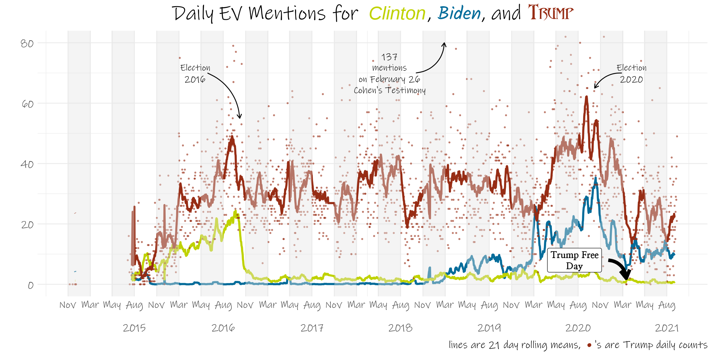
Of course, for the past few years, US President #45 has loomed large over such reporting, so I thought it’d be interesting to look back and see his presence, measured by how often he is name-checked on the site, has changed over time. Hence a little time series chart.
As well as tracking Trump, we also followed mentions of Clinton and Biden. I just counted how often the names appeared, so Trump could refer to him or his children, Clinton is mostly Hillary, but it could be her husband. And we focused on the bulk of the webpage, excluding headers and footers. Here’s how it was done:
ev_mentions <- function(url) {
  w <- rvest::read_html(url)
  pathway_data_html <- rvest::html_nodes(w, xml)
  ev <- rvest::html_text(pathway_data_html)
  z <- str_c(ev, collapse = T)
  biden <- str_count(z, "Biden")
  trump <- str_count(z, "Trump")
  clinton <- str_count(z, "Clinton")
  list(biden = biden,
       trump = trump,
       clinton = clinton,
       length = str_count(z))
}

xml <-  ".top-box , .news-box li , p" # the selector gadget is cool for figuring out which of the webpage are necessary

ev_time_period <- as_date(mdy("11-30-14"):today())

year <- epiyear(ev_time_period)
month <- months(ev_time_period, abbreviate = T)
day <- format.Date(ev_time_period, "%d")
urls <- glue::glue("https://www.electoral-vote.com/evp{year}/Pres/Maps/{month}{day}.html")
url_senate <- glue::glue("https://www.electoral-vote.com/evp{year}/Senate/Maps/{month}{day}.html")

z <- z %>% mutate(quarters = quarters(date))

missing <- z %>%
  filter(length < 200)
missing_year <- lubridate::epiyear(missing$date)
missing_month <- months(missing$date, abbreviate = T)
missing_day <- format.Date(missing$date, "%d")
urls_senate <- glue::glue("https://www.electoral-vote.com/evp{missing_year}/Senate/Maps/{missing_month}{missing_day}.html")

z_missing <- urls_senate %>%
  map_df(possibly(ev_mentions,
                  list(biden = NA,
                       trump = NA,
                       clinton = NA))) %>%
  bind_cols(date = missing$date)

z <- urls %>%
  map_df(possibly(ev_mentions,
                  list(biden = NA,
                       trump = NA,
                       clinton = NA))) %>%
  bind_cols(date = ev_time_period)
width <- 21 # choice of rolling average number of days

z1 <- z %>%
  filter(length > 200) %>%
  mutate(trump_width = zoo::rollapply(trump, width=width, mean, na.rm = TRUE, align = "center", fill = NA),
         biden_width = zoo::rollapply(biden, width=width, mean, na.rm = TRUE, align = "center", fill = NA),
         clinton_width = zoo::rollapply(clinton, width=width, mean, na.rm = TRUE, align = "center", fill = NA)) %>%
  mutate(trump_width = ifelse(length < 200, NA, trump_width),
         biden_width = ifelse(length < 200, NA, biden_width),
         clinton_width = ifelse(length < 200, NA, clinton_width)) %>%
  mutate(trump = ifelse(length < 200, NA, trump),
         biden = ifelse(length < 200, NA, biden),
         clinton = ifelse(length < 200, NA, clinton)) %>%
  select(-length)

z2 <- z1 %>%
  pivot_longer(-c(date, trump, biden, clinton),
               names_to = "candidate_width",
               values_to = "mentions_width") %>%
  select(-c(trump, clinton, biden))

z3 <- z1 %>%
  pivot_longer(-c(date, trump_width, biden_width, clinton_width),
               names_to = "candidate",
               values_to = "mentions") %>%
  select(-c(trump_width, clinton_width, biden_width)) %>%
  left_join(z2)
Next we need some background bits and pieces for the plot, such as a set of date breaks I wanted to have vertical bands in the plot, a palette of colours, and a plot title. I thought I’d pick fonts that somehow tied in with the candidates: something official and neat for Clinton, familiar and friendly for Biden, and dark and foreboding for Trump.
colour_stripe <- c("grey20", "grey30", "grey40", "grey50")
date_range_matrix <- matrix(as.numeric(seq.Date(from = min(z$date),
                                                to = max(z$date), by = "quarter")),
                            ncol = 2, byrow = TRUE)
date_range_df <- tibble::tibble(start = zoo::as.Date.numeric(date_range_matrix[,1]),
                                end = zoo::as.Date.numeric(date_range_matrix[, 2]))
date_breaks <- c(date_range_df$start, date_range_df$end)
candidate_colours <- c("#bfd200", "#046c9a", "#972D15")
plot_title <- glue::glue("Daily EV Mentions for <i style= 'font-family: forum; color:{candidate_colours[1]}; font-size: 60px;'> Clinton</i>, ",
                         "<i style='font-family: Kalam; color:{candidate_colours[2]}; font-size: 60px;'>Biden</i>, ",
                         "and <b><i style = 'font-family:drakon; color:{candidate_colours[3]}; font-size: 60px;'>Trump</i></b>")
And now for the plot itself:
z3 %>% ggplot(aes(date, mentions, colour = candidate)) +
geom_line(aes(y=mentions_width, colour = candidate_width), show.legend = F, size = 1.2) +
scale_color_manual(values = c(clinton_width = candidate_colours[1],
biden_width = candidate_colours[2],
trump_width = candidate_colours[3])) +
scale_x_yearqtr(breaks = date_breaks,
lab = format(date_breaks,
ifelse(month(date_breaks) == 08, "%b\n%Y", "%b"))) +
geom_point(data = z1, aes(y = trump),
colour = candidate_colours[3],
size = 0.5,
alpha = 0.5) +
theme_minimal() +
geom_rect(data = date_range_df,
aes(xmin = start, xmax = end,
ymin = -Inf, ymax = Inf),
inherit.aes = FALSE,
alpha = 0.4,
fill = "grey90") +
coord_cartesian(ylim = c(0, 80)) +
labs(title = plot_title,
x = "",
y = "",
caption = glue::glue("lines are {width} day rolling means, <i><span style = 'color:{candidate_colours[3]};'> • </span></i>'s are Trump daily counts")) +
theme(plot.title = element_markdown(size = 50, hjust = 0.5),
text = element_text(family = "Ink Free", size = 32),
plot.caption = element_markdown(),
axis.title.x = element_markdown()) +
annotate("text", x=as.Date("2016-05-06"), y=70,
label = "Election\n2016",
col = "black",
hjust = "center",
fontface = 2,
family = "Ink Free",
size = 8,
lineheight = 0.5) +
annotate(geom = "curve",
x = as.Date("2016-06-26"), y = 70,
xend = as.Date("2016-11-06"), yend = 55,
curvature = -0.3, arrow = arrow(length = unit(2, "mm"))) +
annotate("text", x=as.Date("2021-04-06"), y=70,
label = "Election\n2020",
col = "black",
hjust = "center",
fontface = 2,
family = "Ink Free",
size = 8,
lineheight = 0.5) +
annotate(geom = "curve",
x = as.Date("2021-02-26"), y = 70,
xend = as.Date("2020-11-06"), yend = 65,
curvature = 0.3, arrow = arrow(length = unit(2, "mm"))) +
annotate("text", x=as.Date("2018-07-15"), y = 70,
label = "137\nmentions\non February 26\nCohen's Testimony",
col = "black",
hjust = "center",
fontface = 2,
family = "Ink Free",
size = 8,
lineheight = 0.5) +
annotate(geom = "curve",
x = as.Date("2018-11-01"), y = 70,
xend = as.Date("2019-02-26"), yend = 80,
curvature = 0.4, arrow = arrow(length = unit(2, "mm"))) +
annotate("label", x=as.Date("2020-08-15"), y = 8,
label = "Trump Free\nDay",
col = "black",
hjust = "center",
fontface = "bold",
family = "Nanum",
size = 8,
lineheight = 0.5) +
annotate(geom = "curve",
x = as.Date("2021-01-01"), y = 8,
xend = as.Date("2021-03-16"), yend = 2, size = 2,
curvature = -0.4, arrow = arrow(length = unit(4, "mm")))
Note how Trump dominated even before the election of 2016, even though he was very much the outsider for that race.